There is one thing certain about managing services: we are uncertain of service outcomes. Service performance levels are uncertain and even the outputs of our services entail significant uncertainty. If we try to persuade service stakeholders to use, to deliver or to manage services in a certain way by using information visualizations, we should be honest about the degree to which we think we understand what has happened, what should happen or what will happen. In this age of Bayesian reasoning, machine learning and other statistical methods, it is increasingly important to understand how certain we are about the “facts” and how to visualize them.
Douglas Hubbard has discussed at length how many people misapprehend their own certainties.1 For many, often for those in technical fields of work, either they claim to be 100% sure of something or they refuse to offer an opinion. Not only is this phenomenon based on unwarranted degrees of certainty—100% sure simply does not exist—it abandons a very wide range of certainty, say, from 70% to 95%, wherein we can make very useful judgements.
The designers of information visualizations will be more or less sure of the information they present. Of course, they can label elements with text. But are there visual ways of indicating levels of certainty? The answer, as we will see below, is “yes”. The question, though, is how certain we can be that these visual methods are effective. In this article I will first present some general remarks about uncertainty and probability. Then, I will examine various techniques for the visual expression of uncertainty.
Describing uncertainty
Uncertainty can be described in many ways. If you ask an engineer how long it will take to resolve a certain incident, you might get the answer “four hours”. And if you follow up with “Are you sure?”, the engineer might respond “Sure I’m sure” or “I’m pretty sure” or maybe “Well, I guess I’m not very sure.” These are ordinal estimates of certainty. But they are likely to be influenced as much by emotion, personality and power relationships as by objective evaluations of uncertainty.
Objective assessments describe certainty with continuous values, usually expressed as a percentage ranging from 0% (certain that an assertion if false) to 100% (certain that an assertion is true). Uncertainty is merely calculated as 100% minus the certainty. So, certainty is the probability that an assertion is true. Uncertainty is 100% less the certainty of an assertion.
We generally want to assess uncertainty over a range of values, such as a segment of calendar time or a range of lead times. We may describe such probabilities using probability density functions:
A probability density function (PDF), or density of a continuous random variable, is a function whose value at any given sample (or point) in the sample space (the set of possible values taken by the random variable) can be interpreted as providing a relative likelihood that the value of the random variable would equal that sample2
Suppose we want to describe the probability of resolving an incident within a certain amount of time—the resolution lead time. That lead time would be the continuous random variable. The set of possible values would range from anything greater than 0 to some large number, say, 525600 minutes (i.e., one year).
Normally, we split up that range into a set of buckets, depending on the meaningful granularity of the lead time. For example, hardly anyone cares if you fix a broken printer in 208 minutes as opposed to 209 minutes. The difference of 1 minute is not significant to the outcomes the users expect. In such cases, a useful bucket duration might be 60 minutes. Perhaps, if you are resolving an incident regarding automated securities trading system, a duration of one minute might be extremely significant, in which case your buckets should be much shorter than 60 minutes.
We want to know how probable it is that the lead time will fall into each one of the buckets. We may describe mathematically that probability as:
These probabilities—in the ranges a to b, b to c, c to d, etc.—are typically visualized using a histogram. Each bucket is counted in the selected sample of data and plotted as a vertical bar. Sometimes, a trend line supports interpolating values. We will return to the use of such trend lines in the examples given below. Labels of percentages make the chart easier to interpret.
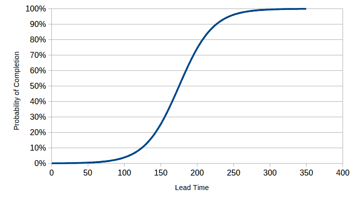
Often, we wish to determine the cumulative probability rather than the probability of a value falling in a single bucket. Suppose a customer requests a change by a service provider, stating that other actions must be coordinated with the implementation of the change. Therefore, it is not the lead time for the change that is most important; rather, it is the certainty that the change will be implemented by the announced date. In this case, the cumulative probability is useful to ascertain. Thus, the service provider might tell the customer that it is 80% probable that the change will be implemented in 210 hours. If the customer requires greater certainty, say 90%, then the lead time might have to be 230 hours, and so forth (see Fig. 3).
Uncertainty is an attribute of derived statistics as well as of measured or predicted values. For example, it is common to assess the correlation between two values. The analyst may then make an inference about whether one of those values might contribute to causing the other value or whether a third variable contributes to causing the tested variables. Thus, the measure of covariance is a proxy for the certainty of a possible causal relationship.
There are rules concerning how uncertainty is propagated from one or more independent variables to a dependent variable.3
Systematic versus random uncertainty
Uncertainty may be classified (among other ways) as being due to systematic causes or to random causes. Deming referred to these causes as special causes and common causes, respectively. A systematic cause should be identifiable and managed whereas a random cause needs to be identified as such, but not managed as if it were systematic.
Examples of systematic error might be incorrectly calibrated or incorrectly configured measurement devices; behavior designed to mislead or defraud, such as artificially lowering lead times; bugs in software that prevent it from being fit for use or fit for purpose; and many other examples.
Mistaking random causes for systematic causes is a form of bias discussed at length by Kahneman.4 Suppose a major incident takes a long time to resolve and the cause is assumed to be systematic, although it is, in fact, random. Steps are taken to improve performance. Lo and behold, the next, similar, incident is resolved more quickly. The managers assume that the better performance was due to the improvement steps, thereby perpetuating those steps as “good practices”. But the reality was that the poor performance was at the lower range of random effects, so the next case would almost certainly show an improvement, no matter what steps might be taken in the interim.
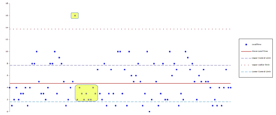
It stands to reason that a visualization indicating the uncertainty of information would add value by visually distinguishing random effects from systematic effects. The statistical control chart is the classic visualization used to distinguish systematic variation from random variation (see Fig. 4). A set of eight standard guidelines helps to identify those data points that reflect systematic, as opposed to random, variation.
For example, the analyst should investigate any point more than three standard deviations away from the mean; or seven points in a row on the same side of the mean, for possible systematic causes.
Rather than oblige each viewer to analyze the plot according to those eight guidelines, why not make them visually compelling? In the example shown here, the yellow background highlights some of the exceptional data points that require further analysis.
How certain is certain?
As we have stated elsewhere, information visualizations are a means of communicating messages designed to persuade recipients to act or decide in a certain way. If we want to communicate in such messages how certain we are about the message, we should have a notion of how probable an assertion is good enough for a given decision.
For example, suppose a customer asks for some new service for implementation by a fixed date. In other words, if the service is not made available by a certain date, then it would serve no purpose to implement it. So, the customer asks the service provider how certain it is that the service can be delivered on time. If the service provider says it is 100% certain, then the customer knows the provider has confused opinion and wishful thinking with an objective assessment of the probability of on-time delivery. Assuming the provider has an objective means for calculating the probability, what would the right answer be?
There is no simple rule of thumb to answer this question.4 The value of what is at risk determines, too, whether to reasonably undertake an action. Such issues occur commonly in allocating limited resources for the various services. Fig. 5 shows a simplified model of the changing benefits (value) of investing in two services, together with the combined value. A grey zone around each curve approximates the uncertainty of the predicted benefits. The width of those zones is determined by the probability that the prediction will be right 2/3s of the time, assuming this is an acceptable risk. If the risks were higher, that zone would have to be wider. The maximum benefits for the combined resource allocations would be somewhere in the indicated range. Note that the range of uncertainty for the combined benefits is considerably greater than for each service separately.
Sources of uncertainty
Before we look at how to visual uncertainty, let’s first look at the different types of uncertainty. We may first distinguish between uncertain measurements of events or states in the past and events or states predicted for the future.
Uncertainty about the past
Uncertainty about the past is typically the result of extrapolating from a sample to a population. Suppose you wish to measure the satisfaction of consumers with your services. In all likelihood, only a small part of your entire consumer base will ever respond to a request for satisfaction levels. All other things being equal, the larger the size of that sample, the smaller the probable margin of error in comparing the sample statistics to the overall population statistics.
When measurements are poorly conceived or poorly executed, they often introduce significant forms of bias into the results. Assuming you are even able to identify those biases, it can be extremely difficult to estimate how they cause your measurements to deviate from reality.
Uncertainty about the future
Predicting the future when it comes to delivering services involves estimating the margins of error in those predictions. In almost all cases, service output is the result of events and starting states of a complex adaptive system. There are far more agents in such systems than can be identified, not to speak of the difficulties in measuring them and their interactive influences on all the other agents. As a result, we use simplifying models to estimate how the system will behave. Furthermore, when behavior is stochastic, we can only predict future states within a range of some breadth and some probability.
Suppose a customer asks a service provider to modify how the service functions. The customer will almost always ask how long it will take to implement that change. Using a model of the complexity of the work and the availability of resources, the provider might come up with an estimate that the average time for doing such work is about 20 days. By performing a Monte Carlo simulation, using historical data for doing similar work, the provider might determine that there is a 40% chance of completing the work in 20 days, a 75% chance of completing it in 25 days and a 95% chance of completing it in 35 days. By using historical data as the basis for the simulation, the many factors impacting lead time that are not easily modeled are also taken into account. Thus, the estimate provided to the customer depends on the degree of certainty the provider believes the customer wants.
Once again, the margin of error in future predictions depending on historical data depends, too, on the factors mentioned for uncertainty about past events.
Visualizations of uncertainty
Let’s look now at various visualization techniques that express uncertainty. These techniques range from simple ordinal messages to continuous values. In other words, some techniques are designed to express uncertainty as somewhere in the range from little uncertainty to great uncertainty. Other techniques include visual representations of probability density functions or even label with such statistics as the correlation coefficient.
Error bars
An error bar is probably the most common method for visualizing the uncertainty in a graphical representation of data. An error bar is generally is line parallel to the dependent variable of a chart going through each plotted value. Suppose the values are plotted as dots, for example, with the dependent variable on the Y-axis. Each dot would have a line traversing it parallel to the Y-axis. In the case of a bar chart, the line would be horizontally centered on the bar, extending above and below the summit of the bar.
In its simplest form, an error bar reflects three statistics about each data point: at the top of the bar, the bottom of the bar and the place where the bar crosses the plotted value. The interpretation of these positions varies according to the visualization. For example, a plot of stock prices would typically show each day’s high, low and closing price. But this reflects the uncertainty of the market, not the uncertainty of prices.
A more direct visualization of uncertainty might interpret these points as the mean value, the mean plus one standard deviation and the mean minus one standard deviation. This encoding might make sense of the distributions of values were all normal.
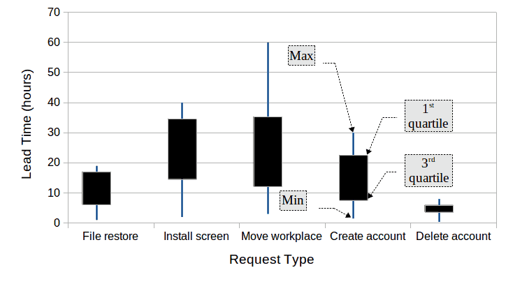
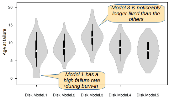
In other cases, the points might encode the median value, the first and the third quartiles. This encoding starts to give a sense of skewed distributions. Fig. 6 provides an example of a box plot with four statistics for each category: minimum value, 1st quartile, 3rd quartile and maximum value. The relative position of the box and the length of the vertical line give indications of the distributions of the values. If it is important to give a more detailed view of how the data are distributed, a violin plot would be a better visualization.
As we have seen, box plots can encode many different statistics. In certain cases, such as in documenting securities prices, the context makes it clear that the visualization encodes the opening, high, low and closing prices. But this is an exception that proves the rule that box plots should be labeled unless a well-known tradition defines the encoding.
Violin plots
I have previously written at some length about violin plots as they may be used for services and kanban. See my article Violin plots for services & kanban. I provide here an example of such a plot (Fig. 7). The sizes and the shapes of the violins give a good indication of the degree of uncertainty in a value as well as how those values tend to be distributed.
Value suppressing uncertainty palette
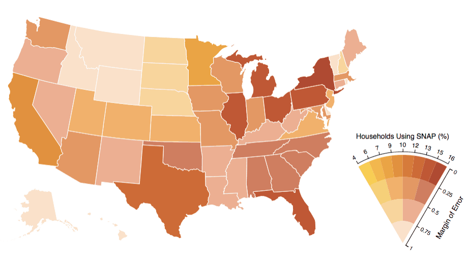
This technique uses color to represent both a value and a level of uncertainty. Changes in hue encode the value being displayed. The degree of uncertainty is encoded mostly via the saturation, with lower saturation indicating higher uncertainty.
The palette describes four levels of uncertainty. The number of bins for the values is a negative power of the degree of uncertainty. Thus, at maximum uncertainty there is but one value. This increases to 2 values, then 4 values, then 8 values for the lowest level of uncertainty.
How does this scheme work in practice? In Fig. 9 we see a map of the U.S. where each statistic is displayed according to the level of uncertainty (i.e., the margin of error in the statistic). To my eyes, it is easy to see that Montana, Idaho, Vermont and Wyoming have a high margin of error (.75–1). The Dakotas and Nebraska have a lower margin of error (.5–.75) and a low statistic (4%–10%), whereas Oregon, Nevada, New Mexico and others have a similar margin of error, but a higher statistic (10%–16%).
This example highlights the drawback of the approach. How easy is it to find the states with a low margin of error (0–.25) and a low statistic (4%–7%)? Maybe my color blindness is making the scheme less effective, except at the extremes.
In any case, the scheme is less than ideal because:
- it uses too many different colors (15)
- it uses color to encode two different types of data
- it is easily misinterpreted as encoding a single range of values, rather than a range of values and the uncertainty of those values
Continuous visual encoding
Uncertainty is traditionally visualized using a density plot. Violin plots include a variant of the density plot. When a time series is plotted as a line, how do we visualize the changing levels of uncertainty throughout that series? Change in uncertainty becomes flagrant as the visualization passes from measurement of past values to extrapolations into the future.
When a set of nominal categories are plotted as a bar chart, where each category might have a different level of uncertainty, how can we visualize that in the same chart as with the bars? The continuous encoding scheme provides a solution to these questions.
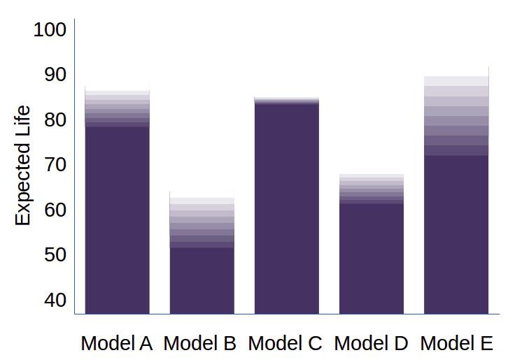
A continuous encoding scheme may be applied to bar charts by associating the thickness of the bar with the level of certainty of the statistic. The result looks like a normal bar chart but with strange caps atop each bar. Those caps are representations of the probability density of the value as it reaches the highest levels.
Look at the example in Fig. 10 to see how to interpret the chart. Look at bar C. Up until a value of about 560, the certainty of the value is nearly 100%. But above that value, certainty starts to drop. By a value of 750, the certainty has dropped to nearly 0%. As you can see in the chart, each category has somewhat different certainty levels at the top of the range.
How could we use such a chart for service management purposes? Suppose we are comparing the expected lifetimes of different models of hard disks. The scale of the diagram might be in 1000s of hours. Thus, the expected lifetime of model C is almost certainly at least 650’000 hours. It might get as high as 750’000 hours, but beyond that there is virtually no chance a disk of that model would last any longer. The shape of the cap atop each bar indicates the distribution of failures once the disk reaches a certain age. This chart is a refinement over a simple bar chart that could only display a single statistic, such as the mean, about the lifetime of disks.
Fig. 11, a gradient chart, demonstrates an alternate method of showing uncertainty on a bar chart. Note, for example, that Model C stays very reliable until near the end of its life. Model B and E, however, have a long period of increasing unreliability at the end of their lives. In this example, gradients could also have been used to document reliability during the initial burn-in period.
A similar convention could be used for a time series plot wherein the plotted values have varying degrees of certainty. This would be the case if the reported statistics were extrapolated from samples. In service management, this might be the case if consumer satisfaction ratings were based on samples, insofar as it might be impossible or too expensive to poll all the consumers.
In such a chart (see Fig. 12), small density plots replace the traditional dots of a dot plot. The height of the plot indicates the level of uncertainty of the value. Note that predicted future values (in yellow) are much less certain than the past values based on samples.
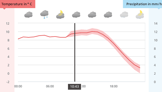
The above encodings of uncertainty provide a lot of information—perhaps more information than many viewers need to make decisions. Fig. 13 shows a simpler technique for a line chart. Before the current time, the temperature is shown as a simple line, based on the recorded temperatures. Since predicted temperatures are uncertain, that black line continues, but within a grey background showing the changing margin of error. The visualization indicates that there is a margin of error, but does not indicate the probabilities within that margin of error.
Hypothetical Outcome Plots (HOPs)
Hypothetical Outcome Plots are animated samples of possible outcomes. These possible outcomes reflect the uncertainty about the data describing a certain state. There is evidence that the use of HOPs can help visualization viewers to better judge uncertainty than with static encoding of uncertainty, such as with error bars or violin plots.
Think of a map showing different possible trajectories of a hurricane where the movement of the storm is animated simultaneously on each trajectory. HOPs avoid the ambiguous encodings that characterize the use of error bars or box plots. Apparently, non-specialist viewers find it easier to make statistical inferences from HOPs than from other visualizations describing uncertainty.
See the articles cited in the bibliography for more details.
Tools for visualizing uncertainty
The vast majority of tools for creating visualizations offer little support for visualizing uncertainty. Box plots are the principal exception to this generalization. While many tools can generate box plots or error bars, they tend to have very limited configurability.
This is less an issue for information visualizations than for data visualizations. We usually expect the latter to be generated in a largely automatic way, once the initial visualization parameters are set. With information visualizations, which take a specific position on interpreting the data and argue in favor of certain decisions, this drawback is less of an issue. That is because most information visualizations require a certain degree of manual retouching of the images to emphasize or to clarify the messages they communicate. Among the visualizations described above, the only ones I have not been able to generate with a combination of automatic and manual tools are the HOPs.
Be that as it may, we can hope that an understanding of the usefulness of visualizing uncertainty and a growing sophistication in the creation of information visualizations will increase the demand for tools that will ease their creation. As that demand increases, the availability of more sophisticated tools is likely to increase.
![]() The article Visualizing uncertainty by Robert S. Falkowitz, including all its contents, is licensed under a Creative Commons Attribution-NonCommercial-ShareAlike 4.0 International License.
The article Visualizing uncertainty by Robert S. Falkowitz, including all its contents, is licensed under a Creative Commons Attribution-NonCommercial-ShareAlike 4.0 International License.
Bibliography
[a] UW Interactive Data Lab. “Value-Suppressing Uncertainty Palettes”. https://medium.com/@uwdata/value-suppressing-uncertainty-palettes-426130122ce9
[b] Munzner, Tamara. Visualization Analysis & Design. CRC Press, 2014.
[c] Jessica Hullman and Matthew Kay. “Uncertainty + Visualization, Explained”.https://medium.com/multiple-views-visualization-research-explained/uncertainty-visualization-explained-67e7a73f031b
[d] Jessica Hullman and Matthew Kay. “Uncertainty + Visualization, Explained (Part 2: Continuous Encodings)”. https://medium.com/multiple-views-visualization-research-explained/uncertainty-visualization-explained-part-2-continuous-encodings-967a7f7c38d0
[e] UW Interactive Data Lab. “Hypothetical Outcome Plots: Experiencing the Uncertain”, https://medium.com/hci-design-at-uw/hypothetical-outcomes-plots-experiencing-the-uncertain-b9ea60d7c740
[f] UW Interactive Data Lab. “Hypothetical Outcome Plots (HOPs) Help Users Separate Signal from Noise”. https://medium.com/@uwdata/hypothetical-outcome-plots-hops-help-users-separate-signal-from-noise-870d4e2b75d7
[g] Jessica Hullman, Paul Resnick, Eytan Adar. “Hypothetical Outcome Plots Outperform Error Bars and Violin Plots for Inferences About Reliability of Variable Ordering”. PLOS ONE, 10(11), 2015.
[h] Barry N. Taylor and Chris E. Kuyatt. Guidelines for Evaluating and Expressing the Uncertainty of NIST Measurement Results. NIST Technical Note 1297. National Institute of Standards and Technology. There are multiple versions of this document. The 2009 version is available from Diane Publishing Co. The 1994 version is available online at https://emtoolbox.nist.gov/Publications/NISTTechnicalNote1297s.pdf
[i] K. Potter, J. Kniss, R. Riesenfeld, and C.R. Johnson. “Visualizing summary statistics and uncertainty”. Proc. Eurographics IEEE – VGTC conference on Visualization. EuroVis’10. 2010. p. 823–832.
Notes
Credits
Unless otherwise indicated here, the diagrams are the work of the author.
Fig. 8: Downloaded from https://miro.medium.com/max/1276/0*J1usESUkh_BhBbIX
Fig. 13: Downloaded from https://www.meteoswiss.admin.ch/home.html?tab=overview






I recently saw another technique for expressing a gradient of certainty, in the context of communicating COVID-19 epidemic scenarios: https://miro.medium.com/max/60/1*XwmBa_l3_y9aPU2dUDxfAw.png?q=20
The visualization takes the now standard curve flattening graphic and expresses the idea that the curve is not an absolute fact, but rather an expression of probabilities. For example, the area under the “flattened” curve is shaded darkly towards the bottom, indicating that this is a very high probability zone of the number of sick people. But, as you come closer to the curve itself, that shading becomes lighter, indicating the increasing level of uncertainty as to where to put the line itself. Thus, the line (the curve) represents a threshold or a level of probability rather than being an absolute prediction of the number of sick people.