ASankey diagram is used to provide a visual analysis of flows. While it might be most commonly used to display the flow of materials through a distribution system, such as petroleum and its derived products, Sankey diagrams are well adapted to provide visual analysis of the flow of any type of work. Thus, they may be useful tools for any organization managing the flow of its work using kanban. This article complements my earlier article on using Marey charts.
What is the origin of Sankey diagrams?
Diagrams to which we have attached the moniker “Sankey” are known (in Western Europe) starting in the mid-19th century. Minard’s 1869 diagram of Napoleon’s Russian campaign is an example. Minard, being a good Frenchman, used a similar technique to document the volumes of wine exported from France to the regions of the world.
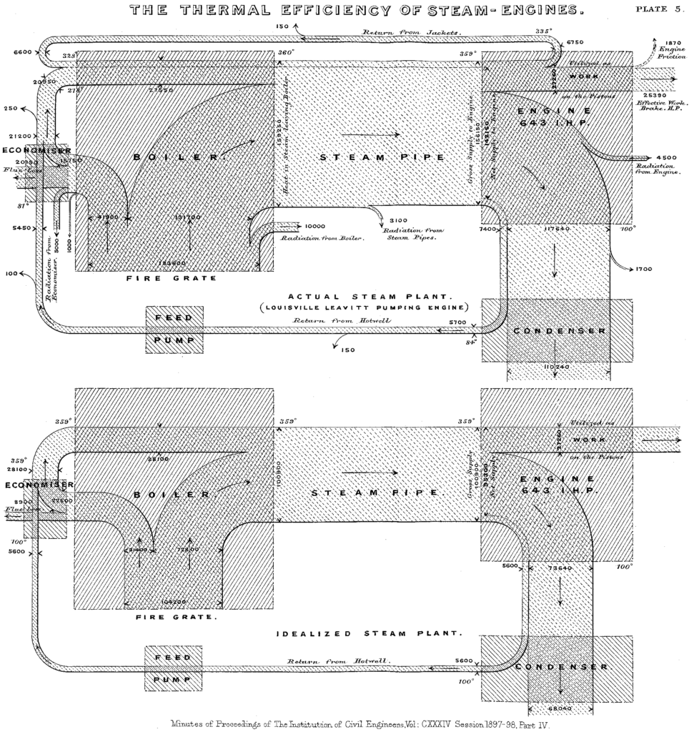
Matthew Sankey himself first used this type of diagram in 1898 to document the energy flows of a steam engine, as shown in Fig. 1.
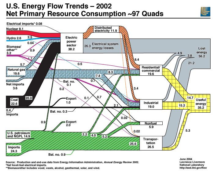
Documenting the flow of energy and of energy resources has remained a typical use of this type of chart (see an example in Fig. 2).
What is a Sankey diagram?
A Sankey diagram consists of a set of nodes deployed on a two-dimensional array and linked together by a network of lines. Those lines, called “links”, represent the flow from node to node. The width of each link reflects the relative volume of the flow between the two nodes thus linked.
In the tradition of the diagrams, when there are flows from a single node to multiple nodes, those lines branch off from each other. Similarly, they join each other when multiple flows arrive at a single destination node.
Sankey diagrams are often displayed on Cartesian planes, but this is not a necessary requirement. The vertical axis normally shows categories of nodes, with the source categories on the left and the destination categories arrayed as required by the structure of the network. This is limited only by the imagination of the diagram’s designer and the need to convey information clearly and precisely.
A simple example might document the types of revenues and types of expenditures of an organization. A more complex diagram might show intermediate nodes. Some flows might be cyclic in nature, either looping directly from a node to itself, or passing via intermediate nodes.
More complex Sankey diagrams may add other analytical dimensions. For example, the horizontal axis might represent geographical locations (as in the diagram of the Russian campaign mentioned above) or time. In the latter case, the width of a line might change through time, giving a clear visual presentation of that evolution. This feature is shared with area charts, such as cumulative flow diagrams.
Sankey diagrams typically treat the elements of flow as fungible. Suppose two flows enter a node and only one flow exits that node. The diagram does not show in the exit flow the sources of that flow from the inputs. It is not possible to trace an individual element through the entire diagram. I suppose this could be possible, using various patterns or hues, but it would render the diagram and its interpretation much more complex.

Using Sankey diagrams with kanban
How can we profitably use Sankey diagrams to help manage the flow of work using the kanban method? First of all, note that a cumulative flow diagram (CFD) is very closely related to a Sankey diagram, insofar as the width of each region in the diagram changes over time showing the absolute volume of flow. The main difference between a CFD and a Sankey diagram is that a CFD has only one pair of nodes, showing a single flow—from the cumulative input into a value stream to the cumulative output from that value stream.
I describe below several possible uses of a Sankey diagram to support the kanban method. There are certainly many other possible uses and I encourage readers to share their experiences and ideas in the comments below.
Work item type vs. customer
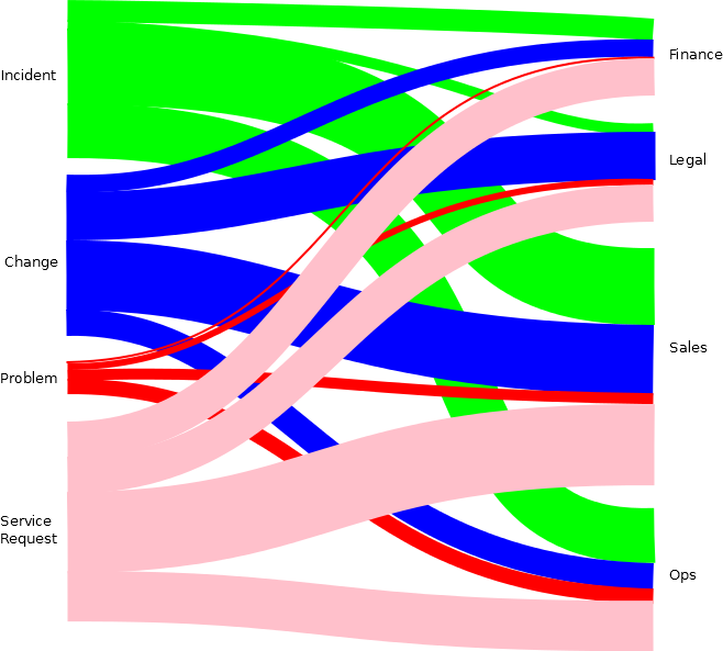
We may use a Sankey diagram to show the volume of work items per the customers of those work items. An example is shown in Fig. 4. We see in that example that the chart immediately shows the relative quantities for each type of work item (incident, change, problem, service request, in this example). It shows the relative volumes by client. Finally, for each client it shows the relative quantity of requested work items. That’s quite a lot of information for a single diagram.
Sometimes the visual impression, based on line thickness, is not sufficiently precise. It is easy enough to add to each work item category, each flow line and each customer the associated count. Other statistics, such as the percentage of the whole, the mean value, the standard deviation, etc., can also be documented in this way.
Classes of service versus customer
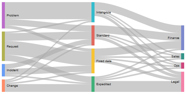
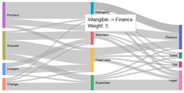
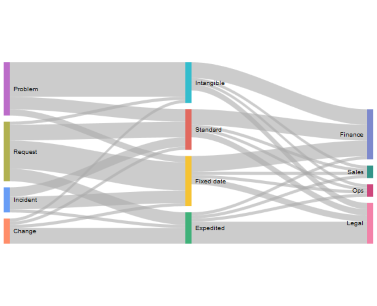
The diagram in Fig. 5 shows a somewhat more complex analysis with 3 nodes per flow. It shows the relative quantity by class of service for each type of work item. It then shows the relative quantity of flows to each customer, from each class of service.
Three of the classes of service—Intangible, Standard and Fixed date— have fewer links going out than coming in. What does this mean? In this particular example, it gives an indication of the number of work items abandoned before they were completed. Note that for this type of diagram, the number of inputs to a class of service node cannot be smaller than the number of outputs. A more formally complete diagram would include an “abandoned” node in parallel with the various customers.
Fig. 5 is an interactive diagram displayed in a web browser. In Fig. 6, we see the same diagram as in Fig. 5, but the cursor hovers over the link from Intangible to Finance. A popup box shows the weight of that link. This gives an example of a tool that interactively documents the data without cluttering the diagram.
Team handoffs
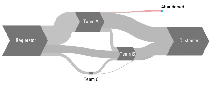
The number of hand-offs from team to team is an important factor influencing the total lead time from the initial request for a service (entry of an item into the initial Ready queue) until the delivery of the result to the customer. A Sankey diagram is a simple way of visualizing the flow of work from team to team. It is easy to quickly identify where the hand-offs occur and the relative proportion of hand-offs versus deliveries directly to the customer. The diagram may also be used to visualize the relative quantity of requests that are abandoned. An example of these uses is found in Fig. 7.
In that diagram, I assume that requests from customers may be first handled by a variety of different teams. There is no centralized filing of requests with a single point of contact. The reasons for this assumptions are explained in detail in my article, “Do we really need service desks?“.
Creating Sankey diagrams
However useful a diagram in communicating information, they are practical only if they can be created and maintained easily. There are various tools available for creating these diagrams. Unfortunately, they are not easily created from standard spreadsheet and diagramming software without considerable customization of that software. To my knowledge, no current tool used to manage virtual kanban boards is capable of generating Sankey diagrams. Otherwise, there are various products available that act as plugins or macros for these tools. I do not intend to provide specific recommendations, however.
A fairly simple tool for creating Sankey diagrams is available from Google, where you may find the source code. It renders the diagram from an html page. The script proposed by Google to create diagrams is pretty basic. Unlike other scripts, it does not allow for dragging components to improve the layout. This tool was used to generate the diagrams in Figs. 5 and 6. I suppose that a similar script is also used by Google to document Users flow in their analytics tool.
This code is so simple that even I can understand and adapt it to dynamically create the desired diagram. In particular, the data array in the page can be readily derived dynamically from any tabular set of data, be it in a spreadsheet or extracted from a kanban software tool. In the worst case, the data can be formatted, copied and pasted into place.
I include in this article diagrams produced with two other tools to give an idea of the possibilities they present. Fig. 3 is creating with the drawing software Dia. It is a purely manual production, meaning that it is difficult to create and to maintain. However, such drawing tools are much more flexible than most of the more automated tools I have seen. Furthermore, if your flow needs to describe a loop (which may or may not be desirable, depending on the circumstances and what you wish to document), most automated tools with throw an error rather than draw the diagram.
Fig. 7 is created with an online tool designed to document financial budgets using a Sankey diagram. While this tool is very flexible, allowing virtually any manual re-positioning of nodes and links, as well as allowing for diagram creation from imported csv data, the labels of amounts are always in US$, which is not useful for most workflows. Thus, the diagram in Fig. 6 has been manually retouched.
For those more technically minded, various Javascript tools have been created that may be integrated into reporting tools:
Mike Bostock’s Sankey diagrams
I hope you find Sankey diagrams a useful tool for visualizing flow and supporting the kanban method.
![]() The article Using Sankey diagrams for kanban by Robert S. Falkowitz, including all its contents, is licensed under a Creative Commons Attribution-NonCommercial-ShareAlike 4.0 International License.
The article Using Sankey diagrams for kanban by Robert S. Falkowitz, including all its contents, is licensed under a Creative Commons Attribution-NonCommercial-ShareAlike 4.0 International License.
Credits:
Fig. 1: By M. H. Sankey – Minutes of Proceedings of The Institution of Civil Engineers. Vol. CXXXIV, Session 1897-98. Part IV, Public Domain, https://commons.wikimedia.org/w/index.php?curid=2734254
Fig. 2: By Energy & Environment Directorate, Lawrence Livermore National Laboratory, Public Domain, https://commons.wikimedia.org/w/index.php?curid=1782286
Fig. 3: Google Earth

[…] ← Using Sankey diagrams for kanban […]