The type of diagram called a Marey chart might be more than a century old, but it can be a useful new addition to the arsenal of tools at the disposal of lean and kanban practitioners.
What is a Marey chart?
A Marey chart is commonly used to analyze transportation systems. It displays the times at which a vehicle, such as a train or a bus, stops at stations on its route. By plotting distance against time, the chart is essentially documenting velocity.
A single chart may typically display multiple voyages of the same route, with one line for each voyage, flight, etc. The chart is essentially an X-Y plot of the distance traveled against the time taken. The distance is represented by the station names along the Y axis and the arrival or departure time at the corresponding station along the X axis. The station names are displayed in proportion to the distance between them. An example of such a chart, created by Étienne-Jules Marey himself, is found in Fig. 1.
You will see there that the city of Dijon, which is about 60% of the distance from Paris to Lyon, is positioned about 60% down the chart from Paris. Similarly, Mâcon is about 85% of that distance and is about 85% down the chart. Since the scale of time on the X axis is linear, the slope of the line indicates average speed during each segment, or hop, of a voyage. Discontinuities indicate the stopping time of a train at a station.

Using a Marey chart to analyze the flow of work
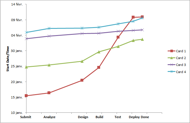
The Marey chart may be adapted to display and analyze the flow of work by a given team in a given value stream. The route, along the X axis, is represented by the nodes, or phases, of the value stream. The time, along the Y axis, displays the starting time for each phase in the value stream. Note that I have switched the X and Y axes compared to the example in Fig. 1. The reason is to simplify the creation of such charts using standard desktop spreadsheet and charting tools. Each of the plotted data series represents an instance of executing the value stream. An example is shown in Fig. 2.

How should one represent the equivalent to the physical distances between stations on a route? The concept of physical distance between value stream nodes, especially when performing knowledge work, is not meaningful (unless you are specifically analyzing the wastes of transportation or movement in the value stream). I recommend representing the concept of distance by using the typical touch time, that is, the duration of the actual work performed rather than the start and end times of the work, for each activity in the value stream. By so doing, the Marey chart is scaled according to that flow efficiency. It indicates variation in efficiency through the value stream and variation from work item to work item. Intuitively, a task with a higher touch time should take longer, albeit there is no necessary relation between touch time and the waste during an activity.
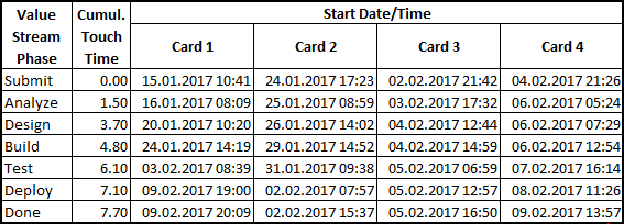
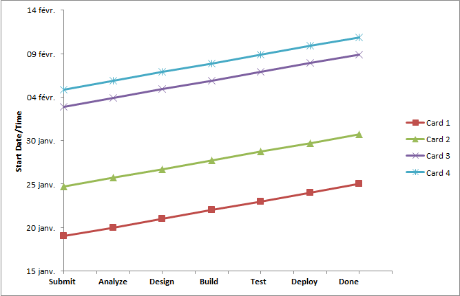
The difference between a Marey representation of an instance of a value stream and a plot where the stream’s phases are merely listed as categories, rather than adjusted for touch time, is shown in Fig. 3. The comparison is based on the plot in Fig. 6. While the two plots look superficially similar, the dashed line gives the misleading impression of some similarity in the duration of the phases of the value stream. While this might be true for an industrial assembly line, it is rarely possible for knowledge work.

One could imagine that some other vector be used to replace physical distance. For example, the size of a batch in a work item might be considered. I have not pursued that possibility, as batch size is not always a meaningful measurement or one with a consistent and repeatable metric, which is often true in knowledge work. But the vector chosen might depend very much on the value stream being analyzed.
Creating a Marey chart
Here are some suggestions for creating a Marey chart for a value stream. First, the average touch time for each phase should be calculated. Work items sitting in a buffer do not, by definition, have a touch time, so the chart should not show the time in buffers as separate nodes. On the other hand, by including buffers in the chart, it will show the waiting time in the buffers, much as the original Marey chart shows waiting times in train stations.
Next, define the sample of data to be collected. Since the chart assumes a consistent touch time, a sample including a significant change in touch time will be difficult to interpret. For each value stream instance in that sample, the start date/times for each phase should be collected. If you wish to use a spreadsheet program to prepare the chart, then each data series corresponds to a single instance of the value stream, that is, a single work item. If the sample contains a large number of instances, it may be more convenient to record the data series in rows, rather than columns. The label for each data series could come directly from the kanban card used to represent that work item, using some unique identifier. It is useful to have labels for the nodes in the value stream, but the typical spreadsheet software will not be able to use them directly. For plotting the values in the chart, the cumulative touch time should be used. An example of the resulting table may be found in Fig. 4.

You will note that I include “Submit” and “Done” in the table. While they are not strictly parts of the value stream, they allow the chart to neatly place submission to the value stream’s input queue at the origin of the chart. Further, it allows for a simple calculation of the duration of the last phase of the value stream.
The chart itself is an X-Y plot. I find it easiest to interpret if both plot markers and lines are displayed. The lines should be left as straight, to avoid erroneous interpretation when value stream nodes are close to each other.
I do not know of a tool that can correctly display the X axis, or the cumulative touch time, automatically. This is because these tools only know how to display linear, equidistant labels or logarithmic placement of labels. This almost never corresponds to the true touch times of the work, especially for knowledge work. Of course, on a simple, automated assembly line, the goal is indeed to have equidistant nodes, however difficult that might be to realize in reality. Be that as it may, the value stream node labels may be positioned manually via the axis title feature of the software. You may wish to hide the automatically generated labels, which represent the numeric values of the cumulative touch time. An example of the resulting chart is displayed in Fig. 2.
As with any other flow analysis, preparing a Marey chart requires a certain amount of manual labor when the data is derived from physical kanban boards and cards. When using a software implementation of a kanban board, all the data required to create the chart is already captured. However, as of right now, I know of no software product that automates the creation of Marey charts from flow data. On the other hand, the captured data can easily be exported to a spreadsheet program and the chart created, as described above.
The number of different types of information expressed visually by the chart will influence the ease with which the chart may be read and the effort required to create the chart. For example, I refer below to the possibility of using different line styles to display a type of information, such as the class of service of a work item. Other types of information, such as the particular resources used to perform the work, might also be represented. However, in each case the analyst must be clear about the benefits of collecting and displaying such information. Unless those benefits clearly outstrip the cost of presenting the information, such features are best avoided.
Interpreting the Marey chart
The original Marey charts, used for transportation analysis, gave a simple, visual means for assessing the consistency of the speed of a train. They also help to analyze traffic problems by identifying parallel discontinuities in the lines. See this posting, for an example.
But our subject concerns the analysis of the flow of work. We see in the chart that each segmented line, corresponding to a single work item or kanban card, has data points corresponding to the start of the value stream phases, as seen in the X axis label.
Since time does not go backward, the lines always go up, but rarely in a linear way. This is because the amount of waste during any given instance of a value stream will value from case to case. Furthermore, the amount of waste and even the touch times are not likely to be the same from one phase of the value stream to the next. This variability is reflected directly in the changing slopes of the lines.
The slope of any segment depends on two factors: the average touch time for the work and the actual lead time for the work. The slope is inversely proportional to the average touch time and directly proportional to the actual lead time. Thus, by scaling the chart to average touch time, the lines are corrected, much like the seasonally adjusted unemployment figures calculated by economists.
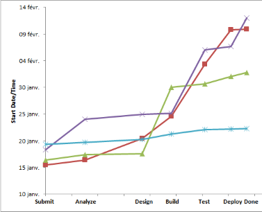
The slope of a line segment combines two factors: the absolute duration of the phase and the relative proportion of waste to value-adding work during the phase. However, the chart gives no direct indication of that proportion. Instead, the chart is useful for visualizing the evolution of that proportion over time. A simplified example of such an evolution is shown in Fig. 5, where the efficiency of the Build activity increases in time, shown by the decrease in the slope of the Build segment.

- blockage specific to the work item that slowed down
- expediting of the work item that by-passed other items
- differences in batch sizes

A Marey chart gives an indication of the volume of work in progress in a value stream at any given time. This may be seen by drawing or imagining a horizontal line across the chart at any given date. The number of lines crossed by that horizontal line indicates the count of work in progress for the value stream at that time. For example, on 20 January, such a line would only cross one line. However, on 30 January, it would cross two lines.
If all the segments of a given line had the same slope, this would indicate that the throughput at each phase of the value stream is the same. If the chart showed a series of straight, parallel lines with the same slope, this would indicate a single piece flow situation where every phase of the value stream was taking the same amount of time. In such a case, we would also expect that the data points would be equidistant along the X axis. Of course, such a situation hardly ever happens, but it helps understand what the chart indicates if the lines become less and less jagged. If a sample shows relatively jagged lines near the bottom (that is, earlier) and increasingly straight lines near the top (this is, later), this is a graphic indication of improvement in the value stream, where the mean lead time of work approaches the mode and the standard deviation of the distribution becomes ever smaller.

It might be useful to compare the visual impression provided by a Marey Chart with different types of fabrics. At one extreme is a felt-like diagram that has little internal structure (see Fig. 7). At the other extreme would be an industrially woven cloth, whose warp and weft are perfectly uniform (see Fig. 8).

In summary, four key aspects of the flow of work may be seen at a glance on a Marey Chart:
- The lower slope of a line, the shorter the lead times
- The straighter the overall line, the more regular the throughput throughout the value stream
- The more the lines are parallel, the more the work is performed consistently
- Trends in changes in slope reflect changes in flow efficiency
Comparing Marey Charts to other types of visual management
The lean and kanban approach makes rich use of visual management techniques, using such tools as value stream maps, kanban boards, cumulative flow diagrams, control charts, lead time histograms and many others. What value does the Marey Chart add to the existing charts?
In my own experience, a Marey chart is useful predominantly for the analysis of a problem. Most other lean and kanban tools display mean values and do not take into account the flow efficiency. For example, the value stream map typically shows lead times and waste for each phase of a value stream. However, it documents only a single statistic (mean values?) and gives no idea about the distribution of values, nor does it provide the details of individual cases.
A cumulative flow diagram provides mean counts of work in progress at any given moment, but provides no details for the individual work items. It is useful for managing probabilistically, but does not drill down to the detailed cases. A CFD may well indicate at the aggregate level that a problem exists at a given moment, but does not really help to analyze the causes of that problem.
A Marey chart may provide a simple synoptic view of a sample of cases, showing the corrected throughput and its evolution within a sample. However, it is very difficult for the human eye and brain to analyze the values in the aggregate. For example, can you easily calculate the average slope of the four segments between Analyze and Design? Probably not. For this purpose, a lead time histogram and the underpinning data are much more useful. The benefit of the Marey Chart, as compared to a lead time histogram, is that the latter generally displays end to end statistics, whereas the former breaks them down by value stream phase.
Control charts are similar to Marey Charts in that they show a detailed evolution of performance over time. Control charts make it very easy to visually identify special cause variation. Too, they focus on end to end lead time which, from a customer’s perspective, is one of the important statistics. While Marey Charts are more difficult to use for distinguishing special cause variation from common cause variation, they do help the service provider to make a detailed analysis of flow, phase by phase. For Marey charts tell stories, both the story of what happened in handling an individual work item, as well as the story of how the team’s overall handling of work items changes over time.
We may also compare the Marey chart to the kanban board itself. The kanban board shows only a synchronic view of work, at any given moment. The Marey chart has the advantage of providing a diachronic view of work, similar to control charts and CFDs.
Thus, a Marey chart does not replace any of the other, commonly used visual management tools. However, it does highlight dimensions of flow that are not easily seen in those other tools. It is of particular value in cause analysis, when a visual diachronic display of data for the execution of a single value stream, showing all phases, may be highlight trends, patterns and exceptions.
I would be delighted if readers using the Marey chart were to share here their own experiences.
![]() The article How can a Marey chart help analyze the flow of work? by Robert S. Falkowitz, including all its contents, is licensed under a Creative Commons Attribution-NonCommercial-ShareAlike 4.0 International License.
The article How can a Marey chart help analyze the flow of work? by Robert S. Falkowitz, including all its contents, is licensed under a Creative Commons Attribution-NonCommercial-ShareAlike 4.0 International License.


Hi Robert, I came across your article while searching on the topic of Marey charts through an interest of my own in the field of Construction Project Management. Similar concepts to the Marey chart are applied in Construction and appear in various names such as Linear Schedules, Time Location Diagrams or March charts. However your interest may be aligned to a technique known as “Line of Balance” (or LoB) commonly used in Vertical High Rise construction projects. I am actually developing a software tool of my own that can link to the major time scheduling tools used to manage construction projects, and then present that information in Time-Location format. Interestingly, the shapes used to represent the blocks of work can also play a role in determining the efficiency or “flow” of work.