In this series on information visualization, I have suggested many techniques for improving how we visualize service management information. However, we communicate information via a two-way street. Visualization designers could benefit from these techniques, but viewers also need to understand them. How can you increase the visualization maturity of those viewers?
The bias that visualizations should be self-explanatory hinders efforts to expand visualization techniques. After all, if one picture is worth a thousand words, adding a thousand words to explain the picture makes little sense.
As with any form of human communication, learning its grammar, syntax and semantics enriches the use of the communication medium. We can appreciate music at an atavistic level. How much more can we appreciate it with an understanding of harmony, rhythm? We might find a poem beautiful for the sound of its language. How much more beautiful could it be by knowing something of the meaning and allusions of its words and images. We might appreciate the paintings of Leonardo as pretty pictures. But also knowing the work of his teacher, Verrocchio, shows us Leonardo’s genius. In short, we can communicate at the level of baby talk or we can make efforts to enrich our communications, adding insight, economy, beauty and effectiveness.
Building Trust
Developing the maturity of visualization audiences requires the audience members to attend to the visualization.1 In other words, they must pay attention to the visualizations, on the assumption that they contain useful messages. The more the audience trusts the visualization designer, the more likely will it attend to the visualizations and their messages.
Suppose you were to receive a registered letter from the tax authority. The letter apparently requires some action but includes a word you do not understand. You will make it your business to learn what that word means and retain that knowledge for future messages. Compare this to the case of opening an unsolicited commercial message where the message obviously intends to sell, not to inform. You will be much less likely to look up any words in that message that you do not understand.
The relationship between trusting the designer of visualizations and the maturity of the visualizations can be either a virtuous cycle or a vicious cycle. If you start on the right foot and from the very beginning provide timely, accurate and useful visualizations, your audience will increasingly trust you. But if you start on the wrong foot, your messages might be ignored. Your communications become increasingly viewed as SPAM. Perhaps you have seen examples of these phenomena when looking at visualizations of the progression of COVID-19. You tend to return to those visualizations that provide you with the information you want in a way that suits your level of understanding. You tend to ignore sources that appear to be untrustworthy.
A key question: how shall we start on the right foot in the journey toward greater trust and greater maturity?
Annotations
A visualization creator might first think to annotate a visualization as a means for explaining it. Annotations include:
- indications of the important data
- explanations of how to interpret the visualization
Only the latter type concerns us here.
Let’s take a simple example. Our vision can easily determine if a line is more or less straight. However, our brain has much more difficulty assessing the degrees of curvature. Consider Figs 1 and 2. Can you guess the functions represented by the curves in these two diagrams? Probably not.
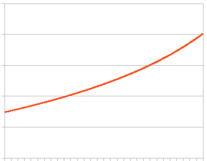
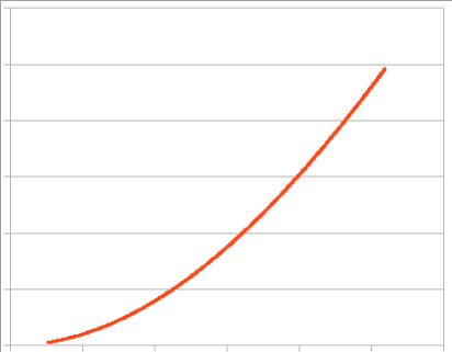
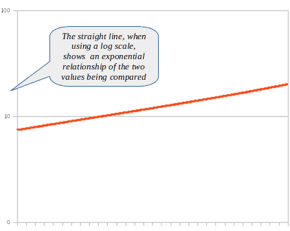
Now consider Figs. 3 and 4. These diagrams represent the same data as in Figs. 1 and 2, but the scale of the Y-axis is logarithmic. If you understand how to interpret a log scale, you would know immediately that the curve in Figs. 1 and 3 represents a tangent or exponential function. The curves in Figs. 2 and 4 unambiguously represent an entirely different function (the function happens to be 1 – cosine).
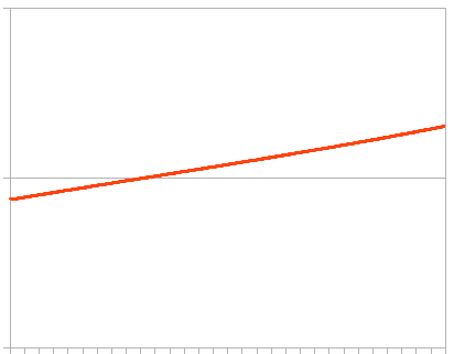
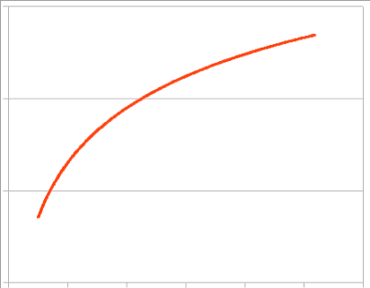
If you understand how to interpret a log scale on a graph, you immediately benefit from using that convention. But what percentage of the visualization’s audience understands the use of log scales? If not high, an annotation can help train the audience and explain what the graph depicts (see Fig. 5).
Before and After Comparisons
We make take a cue from the preceding discussion for the next learning technique. This technique directly compares a “baby-talk” visualization with a more mature visualization that better communicates the message.
Suppose you wish to illustrate the continuous evolution of relative proportions of a variety of categories, such as the market share of services used by customers. Doing this with baby-talk graphs, such as bar charts, requires multiple bar charts, one for each point in time (see Fig. 6a). Grouping the bar chart (Fig. 6b) improves the visualization, but it aggregates the data into discrete periods, rather than showing continuous values. A streamgraph makes a more economical visualization of the same data and includes much more information (see Fig. 7). Comparing more than two bar charts challenges cognition. In streamgraphs, viewers see at a glance the growth and waning of each category. The visualization displays data continuously rather than at discrete times. Ideally, streamgraphs should interactively display data values according to the position of the mouse cursor (if the message being communicated requires such data) (see Fig. 8).
If the designer shows the two different versions of the visualizations side by side, the viewer will quickly realize the many advantages of the more mature visualization, so long as it communicates the desired message more effectively. The viewer would need little text to understand the inherent advantages of the one over the other. We seek an “aha!” moment when the scales of lazy tradition fall away from the viewer’s eyes.
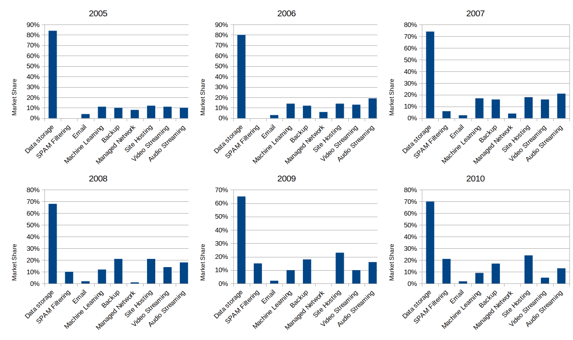
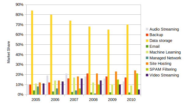
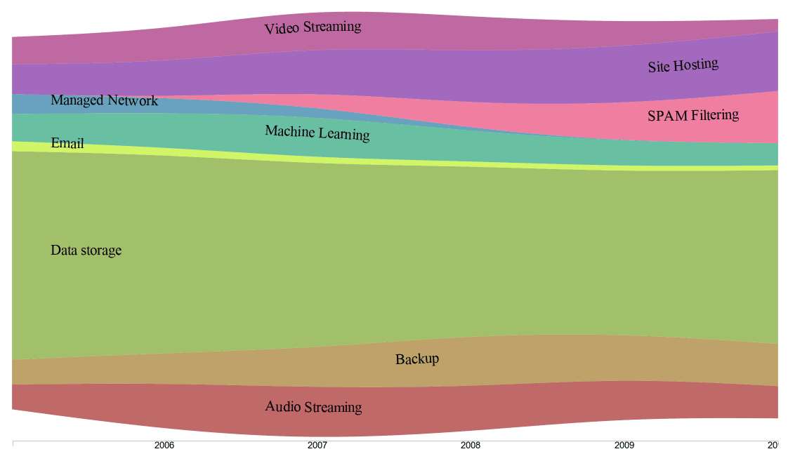
Fig. 8: AFTER: Interactive measurements at each point in the chart can provide details.
Training
Formal training in the interpretation of information visualizations will probably not stimulate interest. However, formal training in the creation of information visualizations will more interest a population of analysts and managers. At the same time, such training will help increase the maturity of the population of information visualization viewers.
The value of a formal training program depends on the habits and existing training infrastructure in an organization. Some organizations maintain a large catalogue of available courses, often delivered on-line. Organizations should encourage employees to follow courses and should recognize their success.
Many of the online training platforms have courses, some being free, on data visualization. Be aware, however, that some of these courses principally concern the use of specific tools, such as Tableau or even R, to create visualizations. I would strongly recommend a more generic study of visualization before learning any tools. Many other courses treat visualization as a discipline subsidiary to the main theme, such as data science, statistics or marketing.
However, if the organization lacks a formal training infrastructure, informal self-study might be more effective. I hope that my series of articles on information visualizations would serve this end. Many of those articles reference standard texts of visualizations which the reader might consult.
Testimonials
Some people will try anything, at least once. Others will doggedly stick with their existing practices, thinking change is always for the worse. But most people feel too busy to invest in new ways of doing things—unless they have a strong reason to believe a change will be beneficial. Testimonials help to provide that reason.
A testimonial states how using a certain visualization made achieving a goal more effective and/or more efficient.
Using the statistical control chart allowed me to identify two underlying problems we never recognized before.
I could replace 12 pie charts with a single heat map, making the weekly usage patterns clear at a glance.
The stream graph showed the evolution of categories, convincing our manager to reallocate resources.
Both formal and informal communications may include testimonials. They may be written or oral. You might even consider using the sort of visual testimonials that appear as marketing materials: mawkish perhaps, but effective.

Fig. 9: An example of a testimonial
Using testimonials:
- reinforces leadership skills
- reduces colleagues’ perception of risk
- encourages the use of more appropriate, more economical and more effective visualizations
Getting feedback
Remember that information visualizations are a form of communication. The receiver of a message can provide feedback to the sender to confirm that the message was well-received, understood and useful.
Organization members should seek to increase incrementally the maturity of their visualizations. Jumping from baby-talk to the most sophisticated of visualization might leave the recipients perplexed. Communications using conventions they do not understand might demotivate them.
Incremental improvement means creating visualizations only slightly richer and more sophisticated than the last ones. If I speak a sentence using six words unknown by my conversational partner, he or she might ignore the message. Using only one unfamiliar word might trigger my partner’s curiosity, who thereby learns a new word. Visualizations are similar. (I am reminded of William Faulkner’s critique of Ernest Hemingway: “He has never been known to use a word that might send a reader to the dictionary.“)
Feedback from the visualization recipient to its creator provides the means to assure that improvements remain incremental and comprehensible. Engaged discussions about the visualizations provide the most useful feedback, but such exchanges are not always practical. Consider using a simple feedback method, such as providing a 1-10 rating system or a set of “good”, “bad” and “neutral” icons (see Fig. 10). A “1” would mean the recipient has no idea what the visualization tries to communicate. A “10” would mean that the viewer finds the communication as useful and concise as possible (given the level of maturity of the recipient).
Fig. 10: A method for capturing feedback about visualizations.
Conclusion
![]() The article How to increase visualization maturity by Robert S. Falkowitz, including all its contents, is licensed under a Creative Commons Attribution-NonCommercial-ShareAlike 4.0 International License.
The article How to increase visualization maturity by Robert S. Falkowitz, including all its contents, is licensed under a Creative Commons Attribution-NonCommercial-ShareAlike 4.0 International License.
Notes
Credits
Unless otherwise indicated here, the diagrams are the work of the author.
Fig. 10: Includes a diagram by Deepthiyathiender – Own work, CC BY-SA 4.0, https://commons.wikimedia.org/w/index.php?curid=45541728


[…] of saturation to different tenses or moods (see Figs. M–O). Of course, such a convention would require training to be correctly […]